MKML: 4 Colors
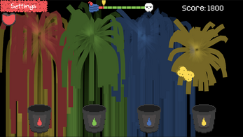
Yo! Picture a place where sponges scatter like sunbeams, and the challenge is to seize and squeeze them swiftly, securing splashes of vibrant yellow within buckets. Spread each eye on different sides so as not to lose or die. This game will make test your reflexes, velocity, flexibility. Not you, sponge are… yellow.

Go ahead! Greedy grab a flying sponges, gather all of them. It should be grasp, that the difficulty increases over time. You can do everything! You are not… green.

Radiant colors rush in, reigning in the realm of the game, requiring razor-sharp reflexes. Remember, expect a trick from the bucket when it turns… red.

Brace yourself for balance between speed and calmness. Buoyed by waves of vibe, say the game isn't… blue.

Yellow, green, red and blue in a kaleidoscope of colors and shades, as different as people are in their characters. Will you emerge as the sovereign of sponges, the maestro of color? The bucket is set, the sponges await; let the splendid symphony of SQUEEZES BEGIN!
Credits:
Lead Developer & Designer - MobTonio (https://mobtonio.itch.io/)
Programmers - Fwuff (https://fwuff.itch.io/) and Konstantin (https://konstantin777.itch.io/)
Designer - Leonarg (https://itch.io/profile/leonarg)
Development log
- MKML: 4 Colors is now playable on mobile devices!Aug 26, 2023


Comments
Log in with itch.io to leave a comment.
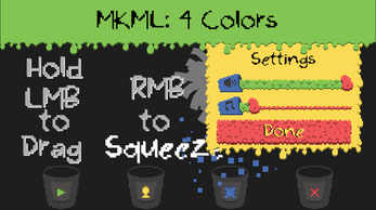
An interesting concept, certainly different from what typically see. However, I have a few suggestions. I found it challenging to progress past the main screen due to the unclear instructions on how to squeeze; it wasn't evident that it required both left and right mouse button clicks simultaneously. Additionally, it seemed that the instructions implied using only the right mouse button. I also believe that replacing some of the textual prompts with images could enhance the game's aesthetics.
Furthermore, during the initial gameplay, it was difficult to determine whether my actions were correct or not. It would be beneficial to incorporate additional elements that provide feedback on the correctness of your actions, such as briefly illuminating the paint can in green or red for a second.
Additionally, it's worth noting that the loading screen appears to be quite simplistic. Improving the loading screen's aesthetics and possibly adding some engaging visuals or better animations could contribute to a more polished and visually appealing overall experience for players.
In conclusion, it's evident that this game presents an interesting and promising concept for a game jam mini-game. However, there are some areas that require refinement to enhance the user experience. Addressing issues like clear instructions, incorporating visual elements, and providing better feedback to players would go a long way in making this game even more engaging and enjoyable. With a bit of polishing, this game has the potential to become a captivating and unique experience for players.
Thank you for insightful commentary! Hopefully we would have time to improve some elements to make game more user-friendly while jam allows it
You're welcome, I hope I've helped you;)